
September 22, 2026 · 3 min read
Why your grade looks wrong on every other screen
You spent a day getting it right, sent it to the client, and they say it is too dark. They are not wrong. Neither are you.
It is a specific kind of sinking feeling. The grade is finished, it looked right all day, and the first note back is that the whole thing is muddy.
Nobody is being difficult. You were both looking at the same file and seeing different pictures, and the reason is that almost no screen shows you what is actually in the frame.
What a calibrated monitor is actually for
A screen has to decide how bright to make a given value, and what color to make it. Left alone, a consumer display decides both in whatever way makes a shop floor look impressive: contrast pushed, saturation lifted, a blue-leaning white point because blue-white reads as crisp.
Calibration is the process of taking those decisions away. A calibrated monitor is not a better screen — it is an obedient one. Given a value, it produces the brightness and color that value is defined to mean, and it keeps doing that as the panel ages.
That is the whole product. Not nicer pictures: predictable ones.
The three things that move
Brightness. A laptop at half brightness in a bright room is showing perhaps a fifth of the luminance the grade was made at. Shadow detail you carefully protected is simply not visible. This is the single biggest cause of "it's too dark" and the easiest to test — ask them to turn it up.
White point. Most screens ship cool. A grade made on a correct white point will look warm and slightly yellow on a cool one, which is why clients often describe an accurate grade as "a bit orange".
Gamma, and the room. The same file looks contrastier in a dark room than a bright one, because your eye adapts. A suite is kept at a controlled level for this reason and not for atmosphere.
Why the room is painted gray
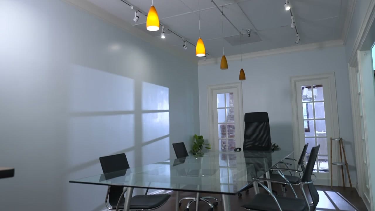
The wall behind a reference monitor is neutral gray on purpose. Any color there — a blue wall, a warm lamp, a window — reflects onto the screen and into your eye, and you compensate for it without knowing. Grade against a red wall for a day and everything you make will lean cyan.
Neutral surroundings and controlled light are not decoration. They are part of the instrument.
What to do about the client's screen
You cannot calibrate the world. What you can do is stop being surprised by it.
Ask where they will watch it. A phone, a laptop in an office, a television in a lit room, a projector — each fails differently and you can grade with the worst of them in mind.
Send a reference frame. One still, with a note: if the darkest part of this looks black rather than dark gray, turn your brightness up. It resolves most "too dark" notes in one message.
Check it yourself on something ordinary. Before it goes out, look at it on a phone at half brightness. You do not have to grade for that, but you should know what it does.
Say what it was graded for. Rec.709 at 100 nits means something to the next person in the chain, and it is the difference between a note and an argument.
The point of a suite
None of this means you cannot cut on a laptop. Plenty of good work is cut on laptops.
It means that at the point where you are making decisions about how something looks — and committing to them for everyone downstream — you want one screen in the process that is telling you the truth. Everything else is an opinion about your picture. A calibrated monitor in a neutral room is the only part of the chain that is not.
Written by Seven Film Studios · craft, post